By Tessa Nacke
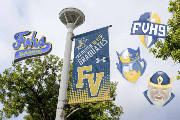
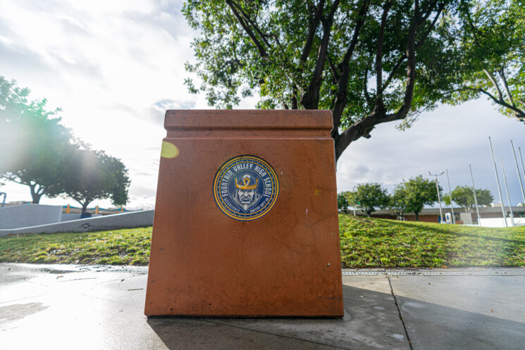
Walking into school on a Monday morning, Fountain Valley High School [FVHS] greets each student with open arms. As you walk onto campus different baron logos leap off the walls, banners, trash cans and gym.
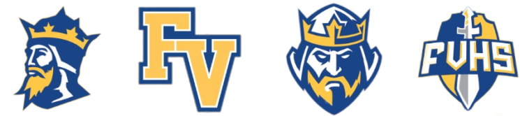
A baron with swords. An angry baron. A coat of arms.
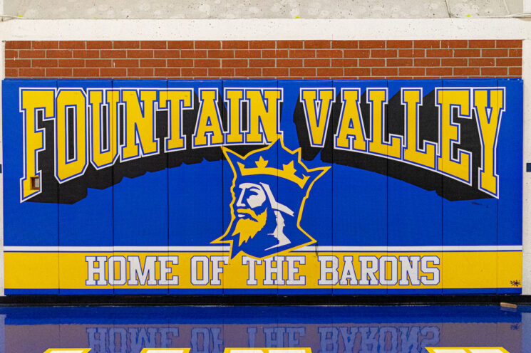
We have many logos to reflect FVHS. These logos all highlight the common colors and mascot of FVHS.
According to the FVHS Website , we have four main logos.
Not only are these logos found on campus, they adorn jerseys, uniforms and merchandise.
How did these logos come to be? Why are there so many different logos?
To answer that question, let’s look back at the history of Fountain Valley logos. Instead of looking in a history textbook, Baron Banner searched through FVHS yearbooks all the way back to the very first in 1967.
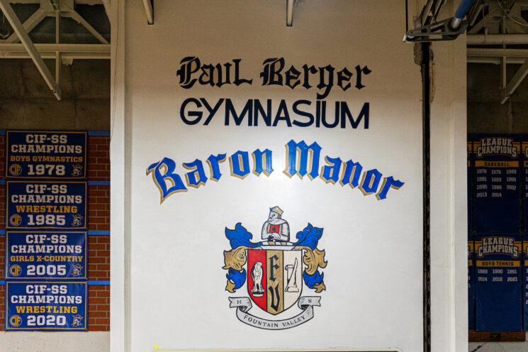
Since the day FVHS opened its doors, it’s had multiple logos. But it all started with the baron coat of arms. This baron coat of arms features many symbols of academia and strength, such as a scroll and an eagle. With curling leaves of blue and gold on either side, the coat of arms has been used to represent FVHS since its inception.
The coat of arms was then simplified, and everything was stripped away so just a simple crest, or shield, remained. This crest came in a variety of different styles, but each centered around the same colors FVHS has today. Fountain Valley’s first newspaper used one version of the crest even before it had a name.
Traditionally, people refer to schools by their initials. Fountain Valley High School is no different. Found on both the coat of arms and the crest, the school initials, FV, were always given prominence. These letters became a central part of many logos as they evolved over time. And the font styles evolved with them.
While the full coat of arms diminished somewhat in use during the 2000s, it made a comeback during Fountain Valley’s 50th anniversary and it is still displayed proudly in our gym.
Not only has FVHS used multiple logos, it has used multiple mascots. A more formal, full figure baron, much like the one we have today, and a cartoonish baron, named “Sir Murgatroid.” Both of these mascots were used interchangeably, as they both embodied the spirit of FVHS.
“It started with the original crest as a school logo when it gave rise to a mascot at some point… but overall the look of a ‘baron’ started to take shape,” said Morgan Smith, the former principal of FVHS and current principal of Marina High School.
As this Baron takes shape, so do the logos of the sports teams.
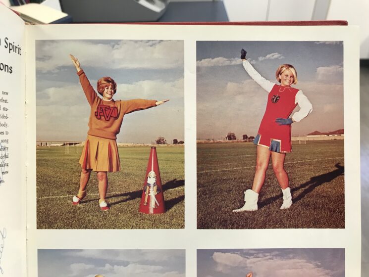
Although FVHS had a set logo, each sports team chose their own. These specialized logos were used on jerseys and uniforms. In the picture above, notice the use of navy, rather than the royal blue seen today.
Logos even varied within the same sport. Sports teams used different fonts to distinguish the levels of each team. Varsity would have one logo, and JV would have a completely different one.
The most common logo we know today is the baron head, the bust of the full figure.
This baron head, sometimes called the “traditional” baron, is a stylized version of the full figure baron. This logo was created during the summer of 2004, after John Shipp was hired as Fountain Valley’s head football coach.
According to Shipp, he and his coaching staff wanted a more regal logo that represented the values of the football team—honor and leadership—as well as something that could represent the school as a whole.
Shipp worked with Tim McMillen at Lytle Screen Printing to design the logo. This new baron was similar to the full figure baron, but details were refined. Lines were sharpened, the points made more prominent, like in the crown and the beard. The colors of FVHS were also added for extra flair. The older logo featured more minute details, as well as almost a full shoulder.
“[The traditional baron] is who we use when we do any kind of advertisement for Fountain Valley outside of our school,” said Paul Lopez, the current principal of FVHS.
Then around 2013, according to Dr. Morgan Smith, former FVHS principal, the activities department commissioned a branding package featuring a forward-facing baron head with and without a sword and shield.
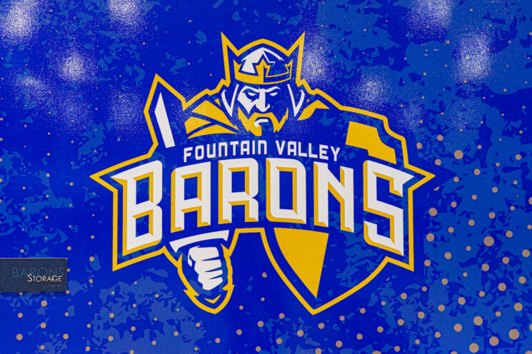
“[Those logos] are surrounded by [swords and shields]…it’s kind of like the barons in battle,” said Lopez
That same rebranding effort created a logo placing the 2004 baron head above the words “Fountain Valley Barons,” with the word “barons” in a larger font size. According to a 2014 brand book, this is the school’s “primary logo.”
A few years later, the first female baron logo appeared.
“After the 50th [anniversary of FVHS], there was a campus discussion of creating a ‘Baroness’, a variation that could be marketed for female students,” said Smith.
In 2018, art teacher Tony Pash created a female baron logo to match the 2013, front-facing logo. Dubbed “Beatrix” Baron, this logo isn’t used much and many people still don’t know about it.
The most recent baron logo was commissioned by Smith and designed by an artist named Jared Mirable, working with the company SWEYDA.
“Jared Mirable is a legend in the art community, and his illustrations have been used for both large commercial projects and exhibited in prestigious art galleries,” said Smith.
Smith told Mirable that the athletics department wanted to create something “different from the standard profile baron.”
Mirable’s baron, known more often as the “angry” baron, can be found on trash cans throughout our school, as well as on sports’ teams uniforms and jerseys.
With the many different logos come many different preferences.
“Some of our teachers hate the mean baron, where some of our teams may really like [it],” said Lopez.
Some people want the traditional look, some want the ‘angrier’ look, and some want more representation shown in logos.
“The classic one [the 2004 baron head] is the one, if it was up to me, if it was my choice, that would be the one we would use,” said Roger Holmes, the current athletic director of FVHS.
As history shows, FVHS has always used a wide variety of logos and identifiers. No one regulates when and where these different logos are used and this is unlikely to change in the future.
“We don’t want to limit anybody on what they can do as far as creating or using the Baron logo,” said Lopez.
Might there be a new logo in the future?
Holmes noted that when winter sports calm down, the leadership team of FVHS will begin the rebranding process.
“We’ve talked about…going through another rebranding thing, all the colors all the same, more of the classic baron head [direction] and just kind of redo what they did 12 years ago,” said Holmes
“We also want to know what [students] think of the logos that we put out there,” said Lopez.
Holmes echoed those sentiments.
“We want to make it a school-wide thing, [so] that we’re…making sure everyone’s included in what they think of the different [logos] that we might do,” Holmes said.